Read loss breakdown, trends, and panel status in the report detail view, and save the report as an image.
Estimated time: 3~4min · Last updated: 2026-03-21
How to
When you want a detailed look at a plant's loss structure and trends
Starting state: You are logged in to PATCH, You have clicked a report row in the list and the detail view is open
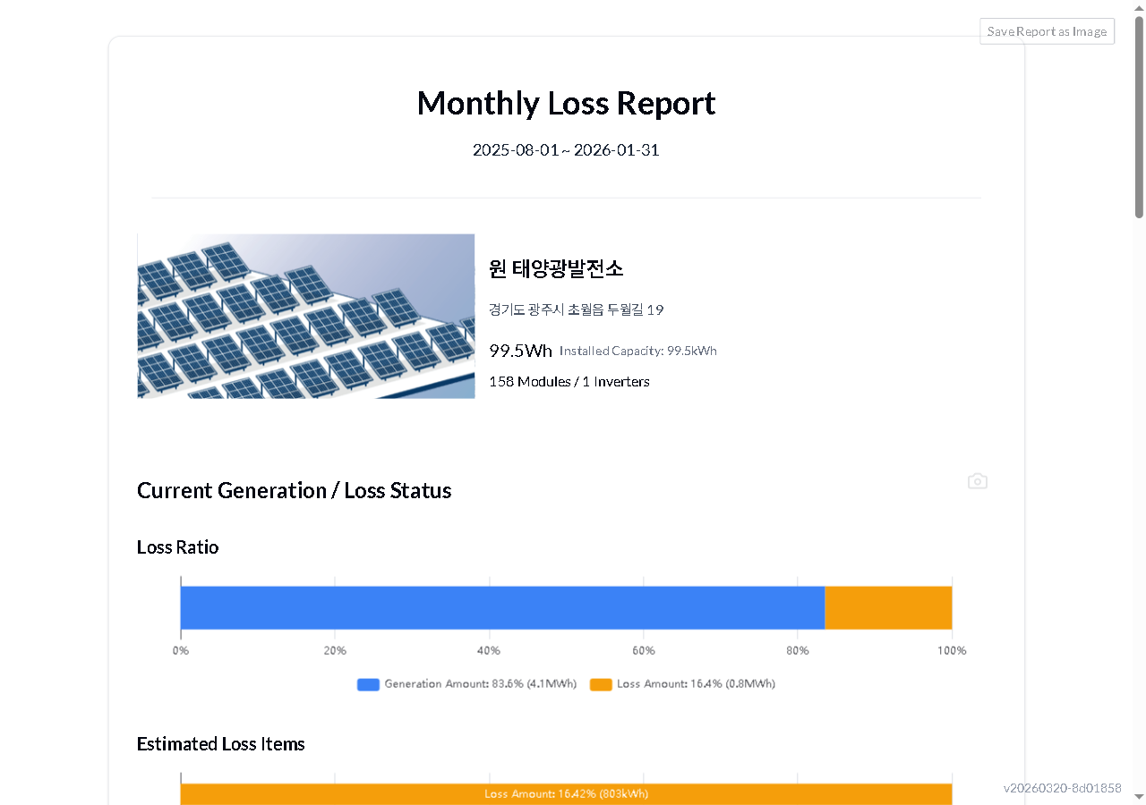
Read the generation (blue) and loss (orange) proportions on the bar chart at the top. In the loss estimate table below, check each loss type -- Shading, Soiling/Vegetation, Fault, and Indirect -- for its kWh value, percentage, and status (normal / needs inspection / caution). Scroll down to see the generation/loss trend chart and per-panel status (count by performance band).
In the Trends section, click Expand Date Range to reveal the list of dates used in the analysis. Toggle View as Loss Amount Change to switch the graph from percentages to kWh-based changes.
Click Save Report as Image at the top right to save the entire report. You can also capture individual sections using the 📷 icon in each section. Click Expand Period to see target analysis dates, and View as Loss Amount Changes to switch between ratio and absolute values.
Expected result
You can read the full report -- loss ratios, trends, and panel status -- and save the whole report or individual sections as images to share.
If it does not work
If the loss ratio chart does not load, refresh the page (F5).
If clicking the save button does not download a file, disable your browser's pop-up blocker.
Step-by-step screenshots
Follow the red-numbered hotspots in the images below alongside the steps above.
1. Read the generation (blue) and loss (orange) proportions on the bar chart at the top. In the loss estimate table below, check each loss type -- Shading, Soiling/Vegetation, Fault, and Indirect -- for its kWh value, percentage, and status (normal / needs inspection / caution). Scroll down to see the generation/loss trend chart and per-panel status (count by performance band).
1
보고서 상세
Report detail — loss ratio bar chart, plant information, and save as image button visible
Loss ratio bar chart — generation (blue, 83.6%) and loss (orange, 16.4%) proportions displayed
2. In the Trends section, click Expand Date Range to reveal the list of dates used in the analysis. Toggle View as Loss Amount Change to switch the graph from percentages to kWh-based changes.
2
보고서 상세
Report detail — loss ratio bar chart, plant information, and save as image button visible
Plant info area — plant name, address, installed capacity, module count, inverter count
3. Click Save Report as Image at the top right to save the entire report. You can also capture individual sections using the 📷 icon in each section. Click Expand Period to see target analysis dates, and View as Loss Amount Changes to switch between ratio and absolute values.
3
보고서 상세
Report detail — loss ratio bar chart, plant information, and save as image button visible
Save report as image button — click to download the current report as an image file